never make a suicide joke again. yes this includes “i wanna die” as a figure of speech. swear off of it. actually make an effort to change how you think about things.
find something to compliment someone for at least 4 times a day. notice the little things about the world that make you happy, and use that to make other people happy.
talk to people. initiate conversation as often as you possibly can. keep your mind busy and you wont have to worry anymore
picture the bad intrusive thoughts in youe head as an edgy 13 year old and tell them to go be emo somewhere else
if someone makes you feel bad most of the time, stop talking to them. making yourself hang out with people who drain you is self harm. stop it.
… 8|
That’s some pretty good advice. I don’t know what’s left of my humor after ‘guess I’ll just die’ jokes but it’s worth a shot.
Personally i went from “guess I’ll die” jokes to “IF I HAVE TO BE HERE FOR 5 MORE MINUTES I PROMISE YOU I WILL BUY JUST, AN ARRAY OF CLOTHES.” and other wild hyperbolic stuff. Just replace the death part with something ridiculous and off topic. Its very entertaining
This also works with calling myself things like stupid, worthless, trash, etc. Even if you do this jokingly to yourself, your brain still believes it, and keeps up the cycle. Seriously, I found that when I stopped saying these things about myself, even jokingly, it made a massive difference.
Here’s a tip I picked up from a friend that’s helped me a lot — replace self deprecating jokes with ironically self aggrandizing jokes
Like every time I trip and fall, instead of saying “l’m just a disaster human” I say “I’m the epitome of grace and beauty”
Or like, when I draw a picture I’m not 100% happy with, instead of saying “my art is trash” I say something like “you know I think it’s time we replaced the Mona Lisa”
When you do that you get to make a joke, but you’re ALSO getting practice building yourself up, y’know?
And eventually it becomes a reflex and you get so used to it that you can say nice stuff about yourself even when you AREN’T joking
Reasons why I hate many life/style transformation shows:
The show: so your clothes are ugly and your family and friends are EMBARRASSED to go out with you. Everyone hates you and the style of clothing that makes you feel comfortable is awful. So we’re gonna rip all that away from you and put you in stylish expensive circulation obstructing skinny jeans, a trendy shirt that you dislike and a blazer because FASHION!
Reasons why I love Queer Eye:
The Fab 5: We understand that this is the way you like to dress and look, so we’re just going to improve it a litle bit but in no way make you look like us or someone else because it’s not the idea. Also, we need to teach you how to eat better for your own health, and while we were getting you new clothes you like, we fixed your house a little bit and redecorated it taking your preferences as the only reference. Also, here’s Karamo, he’ll help you with your personal issues because we care about your emotional wellbeing a lot. *Kisses the person’s forehead*
i looked up the song thats playing in the background only to discover that the guy in the smiley face hoody literally wrote and recorded it this is his song
Shit slaps tho like that’s impressive
no offense but why do they all look like IMVU characters
Texturing is a technique that involves
adding local shading and details on surfaces to better represent the
material of an object.
This technique is of course closely linked to shading in general. This is usually applied after defining a global shading.
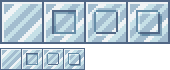
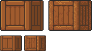
From left to right :
Lineart
Global shading
Completed sprite
One of the big differences between global and local shading is homogeneity. The
very principle of global shading is to give a sufficiently contrasting
effect between the shaded and lit areas to bring out volume and depth.
Conversely,
a texture must be as homogeneous as possible. It must be able to be
applied on large, uniform surfaces, without making it look bad.
2. Applying a texture
A
texture being homogeneous in terms of its luminosity/contrast, if it is
applied to an object without taking into account the global shading, we
will lose any effect of volume and depth.
A texture applied to a sphere without shading. Only the deformation of the texture can give us a clue on the shape of the object, but it is still difficult to discern.
Homogeneous contrast
When applying a texture to an object, shadows must also be taken into account. It
is therefore important to maintain a uniform contrast between colours. A
dark line separating a light zone from a dark zone should not keep the
same colour between these two zones.
The color of the line will be lighter on the lighter side and darker on
the darker side to preserve its contrast with the background.
In
the same way it is possible to apply a texture or pattern on a shaded
object, by proceeding to a simple color shifting in our palette.
Combination of a texture (left) and an object that is not textured but shaded (middle).
3. Local shading
Since shading is used to highlight the bumps, there are generally two possible cases:
A groove
A bump
Each of these cases can be more or less accentuated by playing on the colors, the intensity of shadows and lights.
On the upper line, troughs ranging from the weakest to the strongest bumps. On the second line, these are bumps that stand out.
The
mastery of these light bumps is very important, it is the basis of the
textures, and will make it possible to manage all the simple cases, such
as wood or matte plastic.
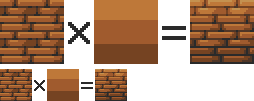
Example of application on a simple object:
4. Reflections
The application of a reflection is done in a
simple way, by applying diagonal strips of light of varying
thicknesses, and following a few rules.
A trough or bump will create an offset at the reflection level (proportional to the height change). As
for the shadows, there is no absolute, depending on the palette or the
material represented, it is possible to lighten or not the area at the
reflection level. It is also important not to have parallel light bands on faces that are not oriented in the same direction, as on this cube:
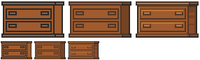
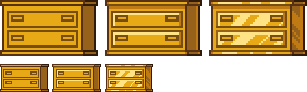
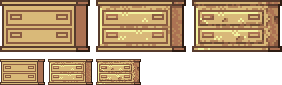
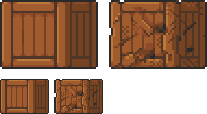
Concrete example of the application of a gold texture on our drawers:
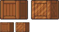
Or, added reflections on our previous crate:
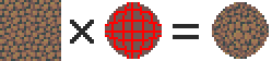
5. Dithering and granularity
Dithering consists in
creating a new false color from a checkerboard or other regular pattern
of two colors close enough to give an illusion of mixing. The closer
the colours are, the stronger the illusion will be. The more the colours
are contrasted, the stronger the granularity effect will be.
Dithering is basically used to obtain fake intermediate shades on
limited palettes, but it is also very useful for making complex and
rough textures.
Example of complex dithering separating 3 colors over a wide area.
The nature of the pattern totally changes the roughness aspect.
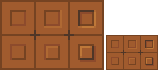
Example of the application of a sandy rock on our drawers:
Or add grain to our crate:
6. The art of destruction
The more complex a texture is, the more it will combine fundamental techniques such as bumpiness, reflections or granularity. However, some materials need to go further, by cutting, slash or breaking the base support.
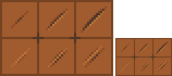
Cuts It works much like bump, but on a much finer surface. We are subject to the same rules, of which here is a summary image:
From the finest to the most pronounced, on the first line of the cuts, and on the second of the bumps.
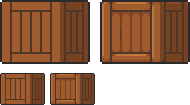
A concrete example on our crate:
Exercises
Since nothing beats practice to learn, here is a series of examples from the simplest to the most complicated.
For each exercise resolved, post your results.
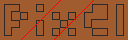
Mastering tools
Add
a strong bump on the text of this image, except the ‘x’ which must be a
groove (the center must be dug more strongly than the rest of the ‘x’):
Palette:
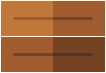
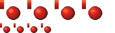
Add reflections on the image obtained between the two red lines shown below:
Now cut and break the letter ‘e’ as well as possible.
Add grain to the letter ‘l’.
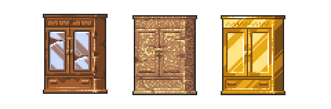
Finalize a sprite
Texturize/colorize this sprite:
Palette:
Add reflections on the inside of the doors to give the impression that there are windows.
Add damage (cuts etc) on the right side of the wardrobe.
Make a variant of this cabinet by redoing it in gold using the palette of the gold drawers example in the tutorial. Palette: